This blog post was written by the Monitoring and Evaluation Technical Assistance (META) Project and is included as an archived post on the Switchboard blog.
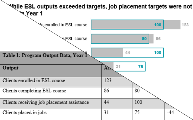
If you serve refugees in the U.S., you’ve probably experienced a common challenge: translating all of the valuable data you collect into relevant messages for a given audience, whether they be for your donors, your organization’s leaders, community members, or others. META’s webinar Effective Presentation of Data for Reports, Winning Proposals, and Outreach describes some simple steps to help improve your data visualization skills—and you don’t need fancy software for any of them. Let’s look at an example, a typical table summarizing program data:


While a table like this may get the job done, it doesn’t communicate about this program as quickly and clearly as possible. Here’s one way we could improve it:


This new chart follows a few simple principles. Transforming raw numbers into visualizations helps the audience quickly grasp the intended meaning. It’s easier to skim past a message if buried in a table, harder if a visual and title make the point obvious. This also prevents confusing or overwhelming the reader with too much information at once: there is no need to include the deviation when the visual already makes it clear.
While this might look complex, it can quickly be accomplished in Microsoft Excel. Start out with a simple bar chart and make a few changes to the default formatting: change the fill of the Target bar to “none” and add a solid colored border; add data labels to each series (for Target, we chose “Inside End,” and for Actual, “Outside End”); remove the title, axes and gridlines; change font; and increase font size. It should look a little like this:


Then, make the bars overlap: click the Target series and under Series Options, select “Secondary Axis.” Just delete the extra axis this creates! If you’d like to reduce the whitespace between bars, decrease the value for “Gap Width” for both series. Finally, add in your title and outer border—this is easier in Microsoft Word than in Excel.
This isn’t the only way we could improve this table. Sticking with the tabular format (which can be useful when you have many data points) you can still change the title, choose more readable fonts and formatting, and add icons or conditional formatting to indicate deviation from the benchmark:


